
Lifts All Unveils New Logo and Visual Identity
Lifts All is proud to introduce its new logo, a key element in the company’s progressive strategy. The new logo reflects the company´s commitment to innovation and forward-thinking solutions.
Symbol for weightlessness, simplicity and upward motion
With a brand-new visual identity, Lifts All aims to deliver the same trustworthy quality, but with a new modern look. The logo features a modern, minimalistic design that conveys weightlessness, simplicity, and upward motion – illustrating the company’s lifting solutions that make material handling smoother and more efficient. The letters “L” and “A” from the company’s name are seamlessly integrated into the symbol, creating a strong visual connection between the logo and the brand.
Arrows are used as recurring graphic elements to further emphasize the sense of upward movement. These arrows are drawn from the symbol’s design, reinforcing the new visual identity.
- Simplicity
- The letters A/L
- Arrow upwards
- Weightlessness

Enhanced Customer Experience
This refreshing update on visual style earmarks Lifts All’s campaign to improve communication and offer even better customer experience.
Lifts All looks forward to continuing to elevate its customers’ businesses, and to solidifying its position as a leader in lifting solutions.

Watch a video with the new logo!
More news articles
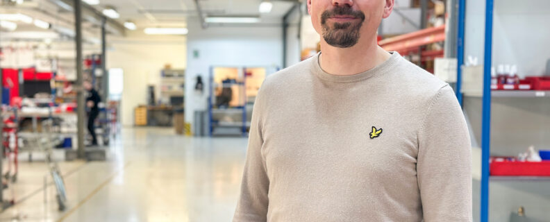
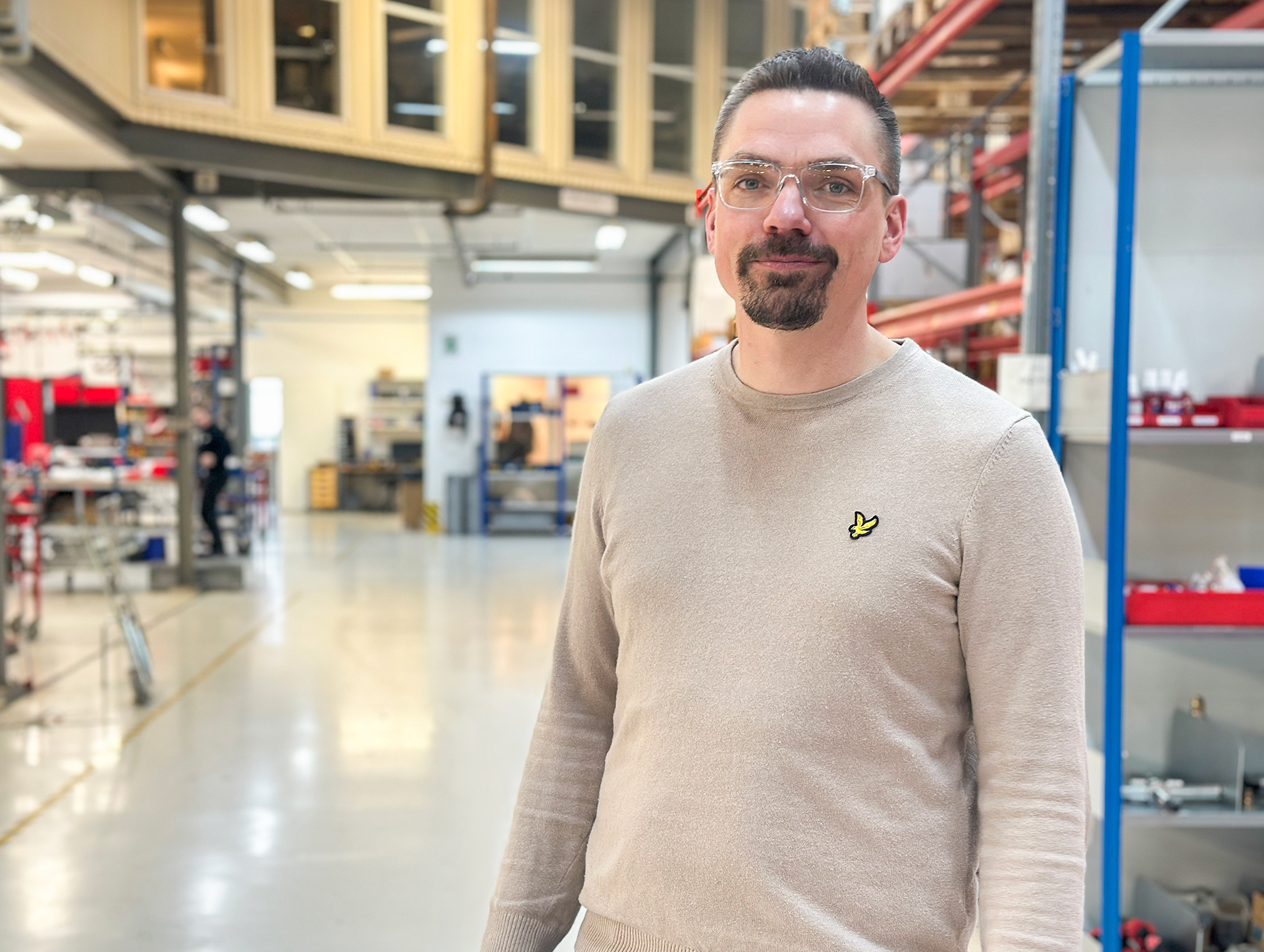
Meet A Coworker – Robin S
Robin, who has been part of Lifts All since 2023, is now taking the next step in his career as he has been appointed Deputy CEO by the company …
Read more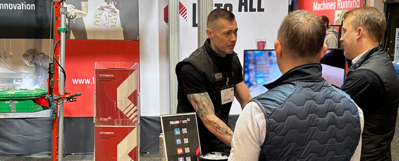
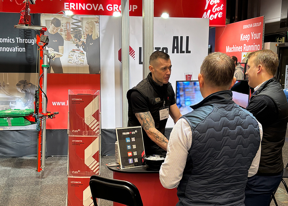
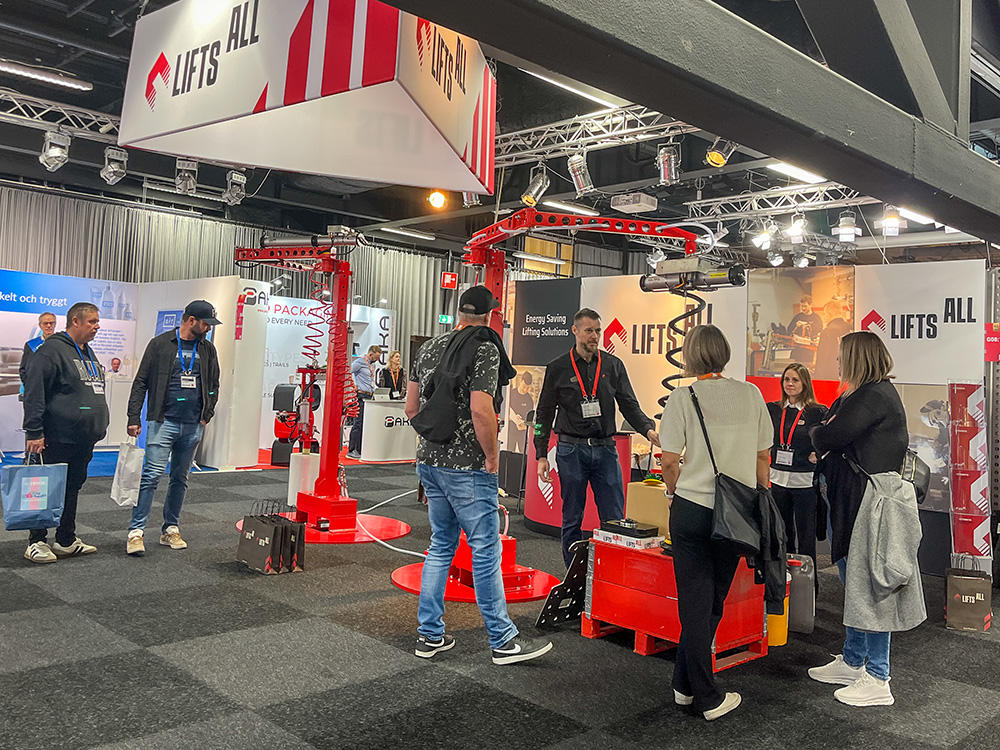
Thank you to all visitors at the Maintenance Fair
We would like to extend a big thank you to everyone who visited our stand at this year’s Maintenance Fair. It was a pleasure to meet so many …
Read more
Meet Us at the Maintenance Fair 2026
We are excited to exhibit at Underhåll- the Maintenance Fair 2026, where we will showcase ergonomic and efficient lifting solutions for …
Read more